


Decoding Parkinson’s: Scientists Aim to Put All the Clues on One Map
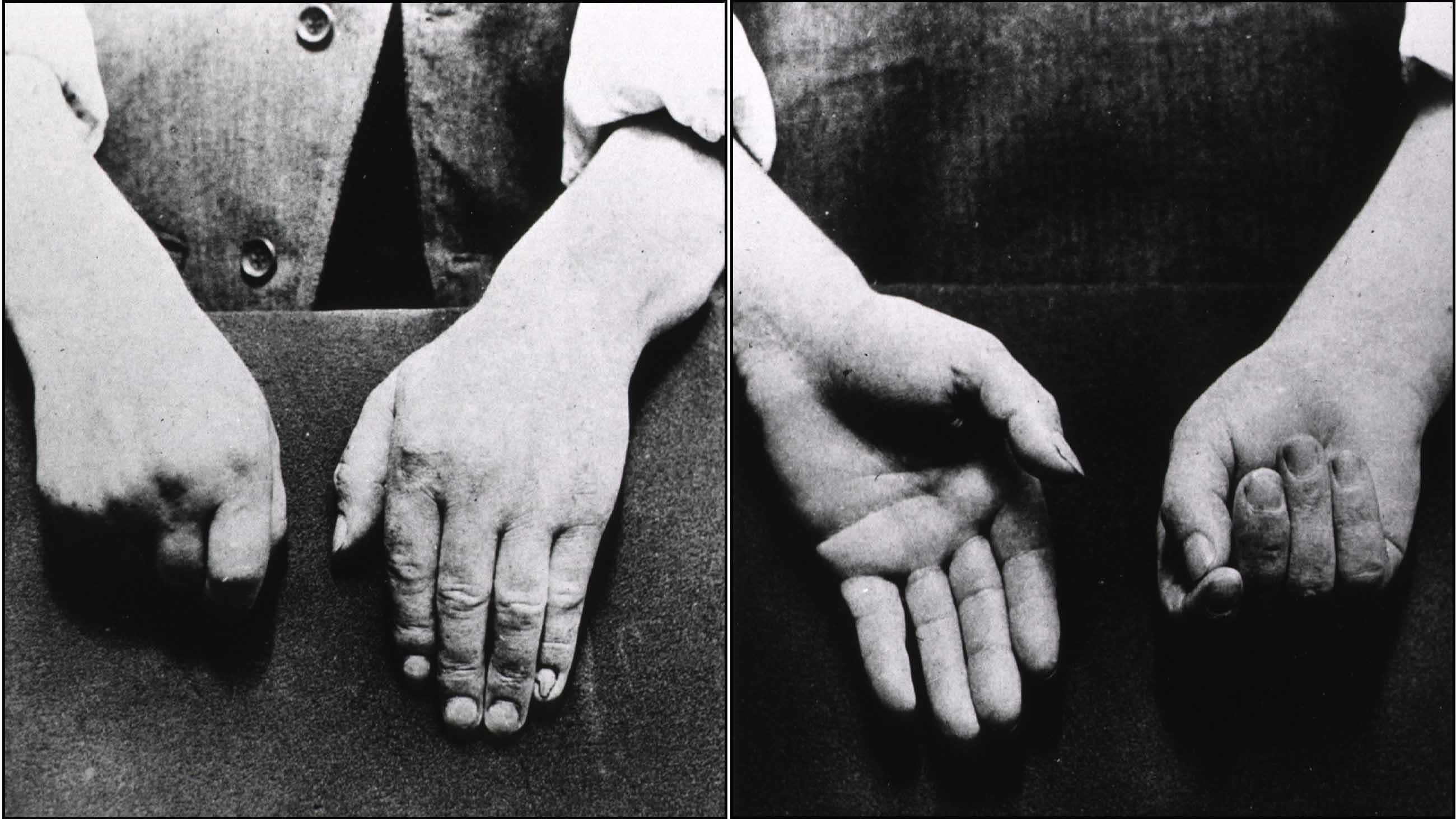
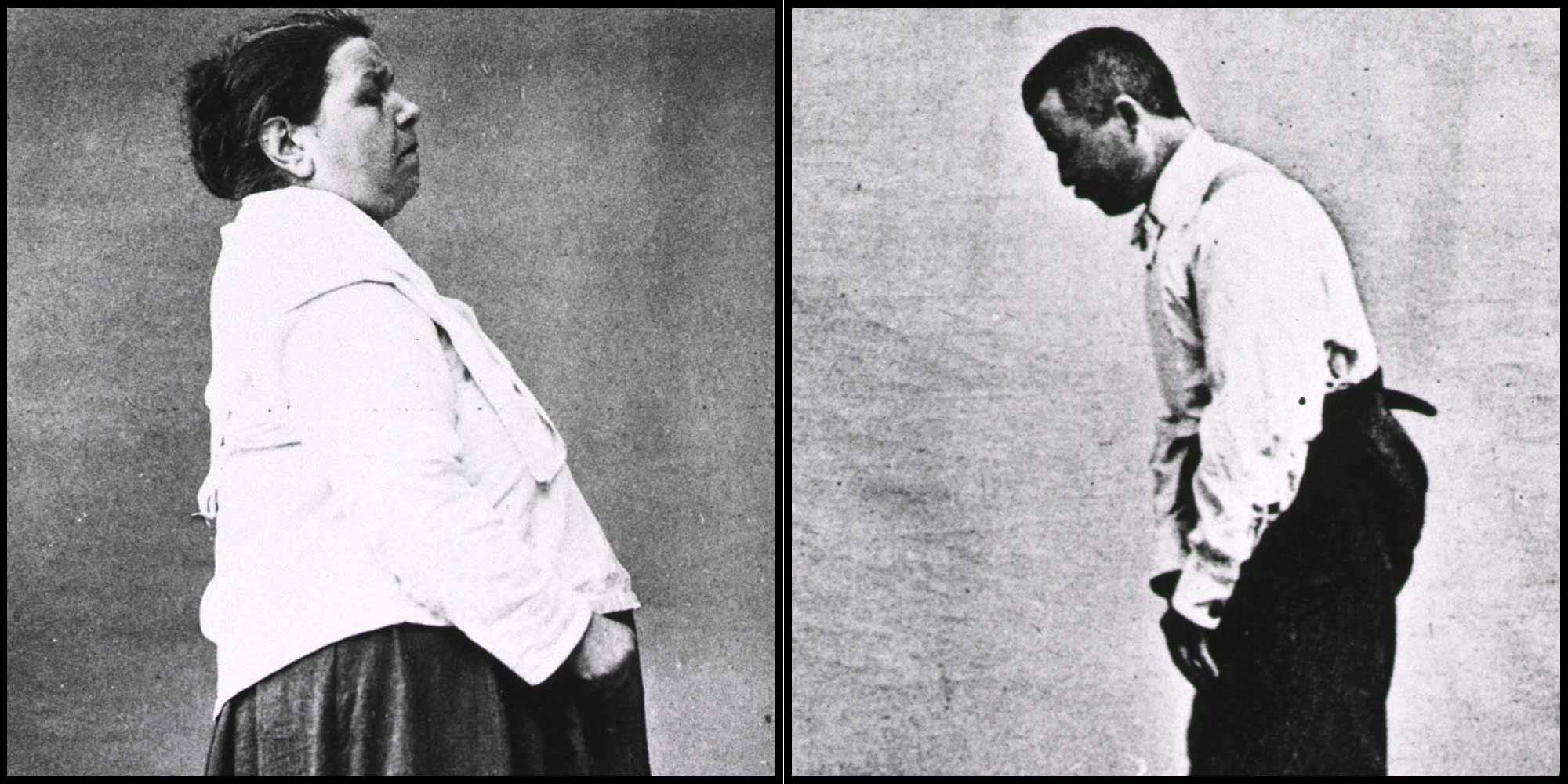
It started as a tremor in his left hand and arm. It seemed harmless, but it surprised him. He was a gardener in his 50s and had no history of rheumatism or seizures or any other significant pain. He brushed it off at first, chalking it up to the exhausting daily work. But it wouldn’t go away. Writing and reading became difficult. He could not direct his fork to his mouth, and had to be fed.
It was the early 1800s, and a surgeon in London had started to collect notes — not just on the gardener but on a number of patients with similar symptoms. Their hands simply failed “to answer with exactness to the dictates of the will.”
The years dragged on; the disease spread to the gardener’s legs, and his trunk started to bow significantly. People couldn’t understand him when he spoke. He passed urine without knowing. The tremors became more and more violent, waking him at night. Nobody understood what he was suffering from.
Finally, in 1817, Dr. James Parkinson published an essay on this shaking palsy. He apologized for his speculative approach, writing that “analogy is the substitute for anatomical examination, the only sure foundation for pathological knowledge.”
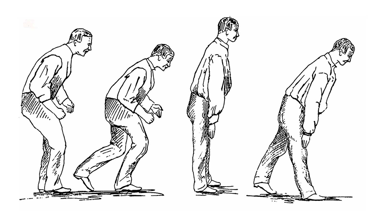
Two centuries later, the disease named for Parkinson is still a puzzle. It is now known that the telltale external symptoms — rigidity, slow movement, a resting tremor — result from a loss of dopamine-rich neurons in a region of the brain called the substantia nigra. But the complete network of steps leading to this cell death is still vague, and the underlying causes remain one of medicine’s great mysteries.
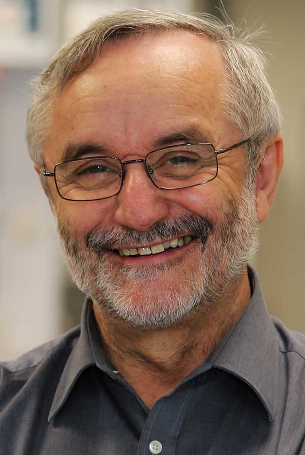
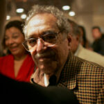
Rudi Balling, director of the Luxembourg Center for Systems Biomedicine.
Visual: ScienceRelations / LCSB
“It’s like a Russian doll,” Rudi Balling, director of the Luxembourg Center for Systems Biomedicine (LCSB), says of this network. “Within each molecule, there are so many functions.”
Now his group’s collaborative and freely accessible project is trying to unpack the disease.
For more than nine years, LCSB, with initial assistance from the Systems Biology Institute in Tokyo, has been developing a Parkinson’s disease (PD) map to build a “sketch” of the disease and the trail it leaves behind in the body. There are very few such disease maps. This is the first of its kind for Parkinson’s and perhaps one of the most detailed visual representations of any disease.
Today, after piecing together elements of the disease, the mapmakers feel they have reached the point where they can claim solidly grounded content. They present the PD map as a sandbox where researchers can annotate the connections further and analyze experimental data.
The map opened to the public in 2013, populated with almost 1,000 reactions from about 400 articles. It has since grown threefold, constantly updated with input from the research community. The team, which started out with 10 people curating the first 2013 release, has been building the map, picking out clues from more than 1,300 research papers. (While it started as a collaboration with the Systems Biology Institute, LCSB now curates and develops the map on its own, anchored by a molecular biologist, and two computer scientists.)
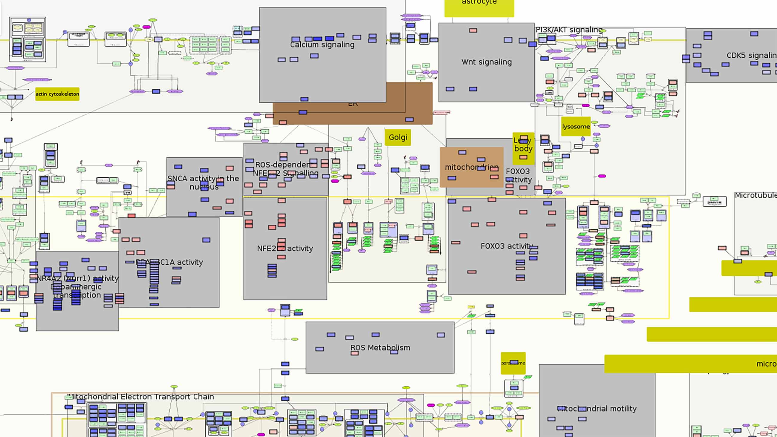
Over the last six years, the mapmakers have assembled thousands of clues to the disease at every level — genes, cells, molecules, symptoms, metabolic changes — linking each element and its interactions and building a visual network of all that is known about the molecular mechanisms of Parkinson’s disease.
The current version of the map calls to mind one of those TV drama investigative scenes, with detectives poring over the crazy wall of clues and connections. Gather all the known parts in one place and one might find new links to solving the puzzle, and open up new questions and avenues for research.
In a way, it seemed like the obvious thing to do — a space where all that is known about the disease is collected, sorted and contextualized. Cataloging molecular pathways isn’t new: Commercial tools like Ingenuity Pathway Analysis and MetaCore analyze pathways and gene maps. But the PD map distinguishes itself by being a fully open visual interface drawn from published research, showing all biological elements specific to the disease and connected to one another.
The map was a merger of two ideas. In the 2000s, Balling, a geneticist by training, was the scientific director of the German Research Center for Biotechnology (now known as the Helmholtz Center for Infection Research), and steered it toward research on infections. Through the same period, a group at the Systems Biology Institute in Tokyo, led by Hiroaki Kitano, had been developing visualization techniques and biological map models.
In 2009, Balling became the director of the newly founded LCSB. He was convinced that for a variety of diseases, there were many mechanisms that interacted with each other, and scientists “needed to disentangle those” to get a feel for the disease. Building on the Systems Biology Institute’s map work, Balling brought in the idea of curating an open-access disease map, a way to chart out the networks around a specific disease and filtering out everything else.
The map has drawn praise from other experts. “I think it’s great work,” said Douglas Kell, a professor of bioanalytical sciences at the University of Manchester, who is not involved with the Luxembourg research. “These people know what they are doing.”
An open map was a strategic move. This was a time when the LCSB was a new entity in the research community. Unlike other research groups, they were not invested in any specific research path — or disease, for that matter. At the same time, they needed to establish themselves quickly and make their presence felt. Creating an open-access linked repository of everything Parkinson’s was a first step.
The map is also open to private players like pharmaceutical companies, who use it to research drug-discovery tools. Balling says he is not overly concerned that some players will use the data to turn a profit. “You can go overboard with being greedy,” he said. “It fires back.”
His intuition is that there will be a move away from a “single disease” approach and toward an effort to find the links among diseases like diabetes, various types of cancer, Parkinson’s, and Alzheimer’s. In a couple of decades, there may no longer be a need to have a separate Parkinson’s disease map. “It will be a victim of its own success,” he predicted.
Decades of probing brain cells have thrown up a smorgasbord of correlations with Parkinson’s disease: malfunctions in connections between neurons, in calcium regulation, and in mitochondria, the cell’s energy centers; a condition called oxidative stress, which is toxic to neurons; microbial imbalance in the gut; metabolism of iron gone awry, leading to inflammatory changes; and proteins clumping together to form structures called Lewy bodies. Only a small fraction of Parkinson’s cases — about 5 to 10 percent — can be attributed to genetic mutations. The overwhelming majority of cases have no such deterministic path.
Individually, the molecular pathways are flag posts on a road map for the disease, faint under the fog of uncertainty. Parkinson’s appears to run on two parallel roads — the slow progression of the disease in a patient and the still slower unmasking by researchers of the network of events that leads to the first cell death.
The disease map might be a space where the two roads cross. But building it has proved something of a thankless job — a lot of clue gathering with no significant finding yet. The effort is not far from what James Parkinson was doing over two centuries ago, but with one important difference. Parkinson was jotting down patient symptoms, which were a result of neuron death. It was useful, but too late to prevent further damage. Even today, motor disorders are only visible in a patient when half of the neurons in the substantia nigra are dead. By gathering early clues, the mapmakers hope to reconstruct the pathways that lead to the death of neurons.
At every new iteration of the map, they improve upon the model with more connections drawn from the literature. Experts in specific pathological pathways guide them at curation workshops through the delicate dance of what to include and what to leave out.
The map starts out with a global overview of Parkinson’s pathways. As you zoom in, specific molecular interactions become visible, like the close-ups of city streets and buildings on Google Earth. In a searchable literature index, each paper has annotated links to show its place in the bigger picture of the disease. Take, for instance, a search on the degradation of defective mitochondria by a process called mitophagy. The latest search hit, a 2016 paper in the journal Cell Stem Cell, leads to four elements on the PD map.
The paper showed how mutations in a gene, LRRK2, triggered a set of roadblocks that made cells unable to shed faulty mitochondria. Instead of being safely broken down, the deteriorating mitochondria dump reactive chemicals that are toxic to the cell. The gene’s link to Parkinson’s has been known for many years. But this research hinted at a specific way in which mutations in the gene set the ball rolling for the death of neurons and the spread of the disease. This finding is visually represented on the PD map. Deep within the map, you see the finding depicted as a set of links between mutating genes and their effects. As you zoom out, you see it in the context of everything else known about the neighboring interactions. The new links are like bridges that pop up across existing buildings. Thus it goes for every interaction extracted from every research paper — each relationship between molecule and process is fit within the map.
Despite this attempt to capture the bigger picture, the mapmakers’ work remains frustratingly obscure. Academic publications on Parkinson’s hardly mention using the PD map. When they opened it to the world, the LCSB team had hoped for more interaction with other scientists. It has not quite turned out that way. It’s not widely known even within the Parkinson’s community.
One reason is a lack of communication among different Parkinson’s researchers. “People are rather siloed,” said Kell, the Manchester bioanalytical sciences professor. “Different people work on their favorite gene.”
A single researcher investigating one strand of the disease can hardly be expected to keep up with the whole field. If the map is a tree of links between different molecules, each paper could be thought of as a branch of molecules. Xinnan Wang, an assistant professor at Stanford University and the principal investigator of the LRRK2 paper, had not heard of the PD map when I interviewed her in October 2016. (The paper was not yet on the PD map at the time.) The map was a useful tool to understand the field and see what others have discovered, she said. But everything still needed to be validated with an experiment. “You look at other people’s work, you get excited,” said Wang. “But in the end, you have to still do the work.”
The other groups that need to be involved are clinicians and patients. The map is a long way from making that explicit connection between what doctors see in their patients and what scientists might see in a cell in a petri dish. Understanding the disease is necessary, since most treatment is palliative and based on empirical knowledge. But for the map to be meaningful, it needs to also be relevant to clinicians who deal with patients and who are looking for the “tremor within the map,” said Stephan Gebel, curator and coordinator of the PD map.
Today, researchers come to the map more frequently to understand the disease better. But the LCSB team is hard pressed to articulate the map’s impact in the field because people haven’t yet used it as an integral tool for analyzing their experimental data. In June 2016, the LCSB team presented the map’s potential by showing how a protein called alpha-synuclein might have an earlier role in the progression of Parkinson’s (at least in mice) than had been known. It was the first use of the PD map as it was intended, Gebel said —not just as a knowledge repository, but as “a new way to evaluate data.” The mapmakers are beginning to progress from mere curation of data to making sense of it.
It may well be a few years before this can lead to new questions. The PD map is backed not by a hypothesis, but by a guiding philosophy that complex living systems are more than the sum of their parts. This approach only echoes what has been uttered across the centuries, from Kant to Goethe to Schrödinger, that an overly hypothesis-driven approach could cloud our judgment and prevent us from seeing phenomena in relation to one another and to ourselves.
But while the PD map sheds light on the bigger picture, it will remain incomplete if other researchers don’t step in. The LCSB team worries that it will lose its value if it doesn’t make itself a useful tool for Parkinson’s researchers. The sentiment is not very different from that of James Parkinson in his 1817 essay. He apologized for his opinions on shaking palsy “in their present state of immaturity and imperfection.” He felt he had shed light on a bigger picture. But he hoped that it would motivate other surgeons to investigate further, or the work would never be complete.
Venkat Srinivasan is a writer based in Bangalore, India.
Comments are automatically closed one year after article publication. Archived comments are below.
I stopped most of my Parkinson’s disease medications due to severe side effects and I started on herbal treatments from Natural Herbs Centre (naturalherbscentre. com), the treatment has made a very huge difference for me. My symptoms including body weakness and Swallowing difficulties disappeared after few months on the treatment. I am getting active again since starting this treatment.
The commonly used.pesticide pyrethrin, used widely for over 100 years, was tested on lab rats and was found to cause Parkinson’s.
My friend lived in a place with a well where the land was used a a dump for old farm spraying equipment. After three years living there she was diagnosed. Why, after this study confirmed the correlation, hasn’t this discussion continued ?
What has happened to research about the link between particulate matter in the air and neurological conditions? I have Parkinson’s and have been diagnosed for 10 years. As a young teacher I was sent to Mt Isa , a mining town in North west Queensland in Australia for two years. This was in 1978/79 before serious pollution controls were in place. Copper, silver, lead and zinc were mined here and there were two large ‘stacks’ or chimneys – for the by products of lead mining and copper mining. I would say three or four days out of every week when the wind was blowing over the town we had watery eyes, running noses and irritated throats from the fumes of the copper stack I believe. The fumes from the lead stack were there but we couldn’t see or ‘feel’ them. Also now of course there has been a lot of work done on the effects of lead on children’s development in Mt Isa. I strongly believe that these years of breathing in these fumes was a ‘trigger’ for my Parkinson’s. Of course there is no proof and there are so many other factors that it is almost impossible to prove. Can anyone give me more information on this.
Manganese miners develop Parkinsons symptoms, and perhaps this and other transition metals lead to reactive oxygen stress which harms certain cells.
I also hope they are looking at the impact of mercury exposure as a triggering factor for one form of the disease. And specifically, but not exclusively, mercury exposure that off-gasses from dental amalgam fillings with heat and abrasion, which is pretty much what teeth do, and especially in those with the genetic variats identified by James S. Woods et al to cause neurobehavioral deficits and kidney function changes in boys with certain gene types (see four articles by him in PubMed 2011-2014 reanalyzing Childrens Amalgam Trial data by gender and gene type). A second clue here is the Thomas Duplinsky and Domenic Chicchett of Yale School of Medicine article finding higher rates of neurological, psychiatric, respiratory and cardiovascular disease in CT dentists than carefully matched controls. A third clue are anedoctal reports of noted prevalence of Parkinsons Disease among former dentists in, for example, some assisted living communities. Safe removal of amalgams by a biological dentist with special training and equipment to minimize mercury exposure to the patient, dentist and staff (that go way beyond a dental dam and water spray) has helped some patients arrest and reverse Parkinsons and other neurological diseases.
The ADA has done a masterful effort of capturing FDA over decades, and defending installation of a mercury based restorative material in people’s teeth without their knowledge, disclosure of materials composition, warnings of side effects or health risks, or written informed consent, prolonging the life of a dangerous dental device material on which its affiliates held patents as recently as 1995. They have done a masterful job at capturing medical, media, consumer and regulatory organizations in the US, and in capturing Congress and public officials.
It is time to shine a spotlight into this dark corner of American medical practice and media lack of sight. Imagine a world where there is less neurological disease and fewer behavioral deficits because we joined other nations in their efforts to ban (much of Scandinavia and Japan), restrict (EU voted to end its use in children underr 15 and pregnant and nursing moms on July 1st), and phase down use of mercury dental amalgam, as there are newer, safer materials that have been proven to work in all clinical situations. There are enough unknown health risks for neurological diseases that we do not have to keep perpetuating the known ones.
Brilliant! Your last sentence is sublime. Follow the money, and you will realize why? I have an aunt, Dead from Parkinson’s, and an autistic son, and I am so disgusted.